
Logo Design: Mbowa Press
Mbowa Press
A mark for a publishing imprint
- Client
- Mbowa Press
- Service
- Logo Design
- Year
- [YEAR]
- Scope
- Logomark, wordmark & lockups
- Our role
- Concept, drawing & usage guidelines
Overview
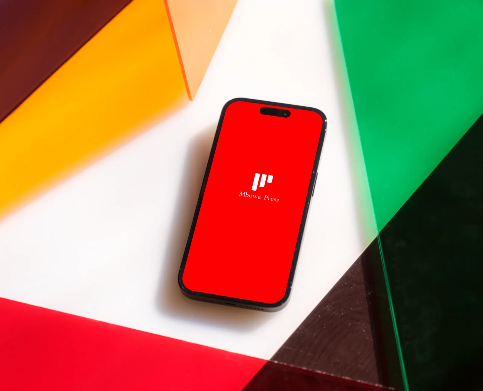
We designed the mark for Mbowa Press — a compact, geometric logomark paired with a classic serif wordmark that works from a phone screen to a book spine.
The brief
A new publishing imprint needed a mark with the authority of a traditional press and the clarity to live on screens — app icons, social avatars and e-book covers as well as printed spines.
Our approach
We reduced the idea to a few confident strokes — a stylised monogram built from the letterforms — and paired it with a quiet serif wordmark. The mark was tested small, in one colour and reversed, so it holds up anywhere.
The outcome
A distinctive, scalable mark that gives Mbowa Press an instantly recognisable signature across print and digital.
Deliverables
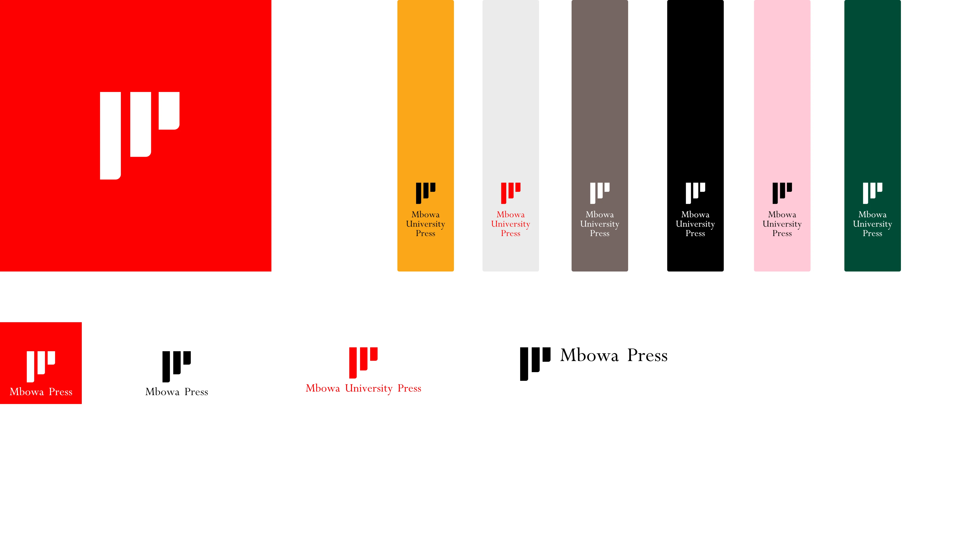
- Logomark & wordmark
- Horizontal & stacked lockups
- Colour, reversed & one-colour versions
Need a mark that sets the standard?